Bike People
CHEEKY MURAL
The newest bike shop in Indy needed a welcoming, energizing space to encourage folks to hang out and connect with fellow fans of two wheel transportation
Setting the Mood
I set up a meeting with the owner to learn about his vision for creating an inclusive, inviting space. The logo is a turtle because Bike People is going against the grain of traditional racing-oriented bike shops. In order to fit the project in before the grand opening, we decided on a Cheeky mural that would lead people’s eyes throughout the very cool, industrial space.
Following our initial conversation, I created a mood board that showed a variety of inspiration ideas. These existing images act as a visual “menu” of sorts. Stakeholders can easily communicate which images they like and don’t like. This stage is incredibly helpful before jumping into original design ideas.

Design Process
Hearing what the Client responded positively to on the mood board narrowed my focus on how to approach the mural design
I used cut paper to create playful, organic shapes and then created a grayscale mockup to show how it would look in the space. There are subtle nods to tortoiseshell patterns without being overt and campy.

Color Exploration
After the Client approved the grayscale version, I created three color options using the brand’s color palette. There were so many great colors to choose from so I created three options I called Light, Bright, and Earthy.
The Client picked Earthy! Next, I picked paint colors to match the hex codes as closely as possible. The trick is using a paint company’s website to color match on screen. Trying to pick out colors in person with paint swatch cards is harder than pre-planning the colors ahead of time.

Painting Process
This interior wall has been freshly painted so I was able to jump into drawing out the design onto the wall. For this design I used the mockups as reference points and then eyeballed where the shapes should go. Part of the Bike People vibe is embracing imperfection so an eyeballed mural seemed like the way to go.
After drawing the shapes on the wall, the fun part began! Each color took 2-3 coats to become opaque. This was my first time operating a scissor lift and it was super fun once I got the hang of it.
The natural light streaming into the space made it a great working environment. I painted the mural before lights were installed so thank goodness for the great lighting!

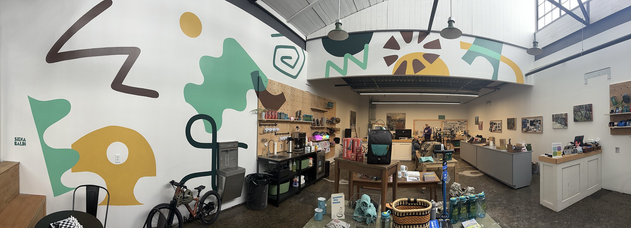
Before and After
From vast white walls to an energy-infused hang out spot


Testimonial
“Siena was very easy to work with and had a straightforward process to translate my ideas into a beautiful finished product we love.
“We had a large blank space and wanted a fun, brand themed, mural to create movement throughout the Bike People space. Siena’s artwork totally brought our space to life!
“Bike People now feels lively and fun, which matches the energy we want people to feel as they shop and hangout. People do double takes as they walk past our windows and are so excited to come check out our space. Siena is the best and I’m forever grateful!”
Matt M.
Owner