My Home as a Canvas Part I: Five Interior Mural Moments
Historic Charm Meets Avant-Garde
My quirky, historic home from 1890 is full of nooks, crannies, and unconventional space. Think bathroom off of the kitchen, hidden compartment behind a bed, four exterior doors and only two are useable. In short, this house would not appeal to everyone. However, it met my specific needs and satisfied my desire for “character” aka non conformity. Classic Aquarius.
I’ve been living in the house full time for four months now. It’s an over-under duplex where each story is basically a one bedroom apartment. During my transition from Hawaii to Indiana, I prioritized setting up the downstairs unit to be a short term rental. While technically I could have left everything as it came, there were stylistic improvements that were important to me.
Early on, I created the name Tourmaline Dream for the downstairs unit mood board. Tourmaline is a gemstone category famous for an ombre between deep greens and pinkish reds. My pink and green obsession now had an outlet!
Design Approach
As an integral part of my vision for Tourmaline Dream, I painted three murals: one big one in the living room, one on a weird pseudo fireplace mantle, and one in the bedroom as an accent wall. My approach to indoor murals has been deeply affected by the show Artfully Designed. Racheal Jackson of Banyan Bridges is one of the two artists on the show and she paints a mural where the focal point of the room should be. It gives your eyes a place to land. The point of a mural is to move your eye around a space. For example, a mural going up a stairwell invites the viewer to journey up those stairs and see what’s at the top. Fluidity and movement are important attributes for a seemingly static, 2-dimensional art form.
I’ve taken this approach into consideration while crafting my house into a cozy home that reflects my personality. The unusual slanted ceilings and oddly shaped spaces call for a restrained use of color and murals. After all, I don’t want people to have a headache when they walk in. The visual busy-ness of the paint colors and design complexity is intentionally more muted than some of my previous artwork.
Techni-Color Theory
My personal journey with color started with really loud, vibrant colors inspired by my tropical environment. Naturally, the crispy aqua ocean of Hawaii along with its kaleidoscope of fish inspired potent color palettes. When I traveled to SE Alaska for the Voices of the Wilderness Artist Residency, the colors of the natural landscape felt extremely potent and beautiful to me while also seeming less overtly vibrant.
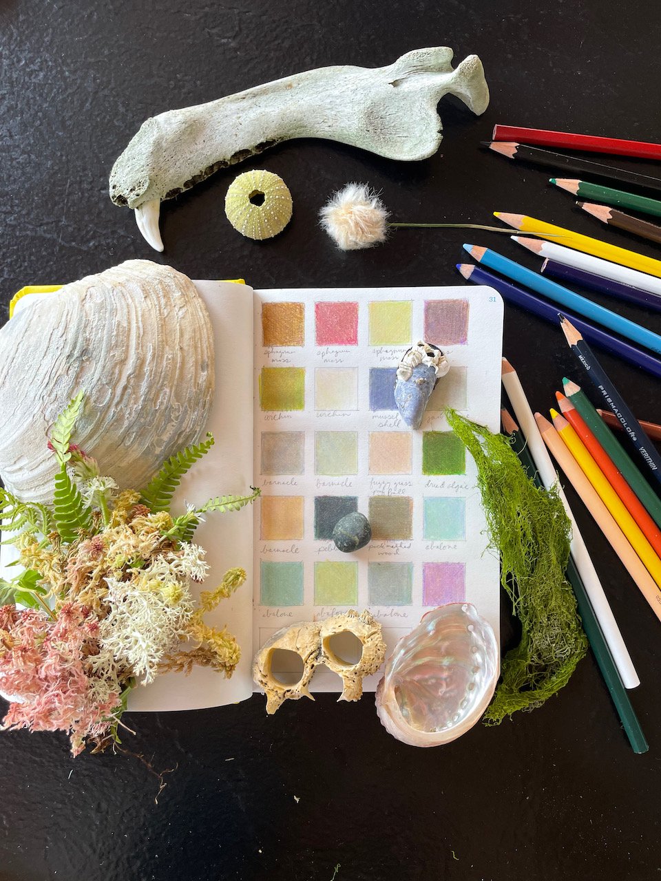
I studied the colors of natural ephemera I collected in the West Chichagof-Yakobi Wilderness outside of Sitka, Alaska. Unlike National Parks, the US Forest Service happily condones collection of item from their lands.
I used Prismacolor pencils to collect a record of SE Alaska’s summertime color palette. This DIY approach to color theory (if it’s good enough for nature it’s good enough for me!) opened my eyes to a more advanced approach to color. Since then, I’ve practiced restraint when picking colors for my artwork. The result feels more understated and enchanting.
Home Sweet Home
Cut to my “new” house in Indianapolis. I knew I wanted to paint fun things on the walls, but also wanted my paint choices to feel sophisticated. In the downstairs unit, I created three moments of color to add pizzazz without adding overwhelm. The entire space had already been painted white and the walls were in decent shape so I kept the main wall color the same. My approach to editing the space to match my design whims included the “if it ain’t broke, don’t fix it” adage to help speed things along.
The wall I chose to paint a mural on is the first thing you see when you walk into the space. It’s in the living room across from the front door. This mural is what I call Full Coverage and the design is all abstract shapes in pinks, taupes, and green hues.
Next, you turn to the right and see a mantle, which I have painted in vertical stripes using some of the same colors from the living room mural. This mantle was originally painted in black chalkboard paint, so it needed to be painted over any way. It also serves as the transition between the fully abstract living room mural and what I painted in the bedroom.
The accent wall in the bedroom area now has a checkerboard pattern. This is a nod to Indianapolis being the “Racing Capital of the World” and the checkered flags used in the Indy 500. I chose colors that played nicely with the pinks and greens of the living room while establishing the bedroom as its own space. There are more rusty reddish browns (aka raw Sienna)
Eat Your Heart Out, Michelangelo
Next up, I tackled the upstairs of the house, which has sloped ceilings. In the bedroom, I created a starry night sky. Painting ceilings is a go-to of Artfully Designed so I wanted to try it out. The mural draws your eye up to the special retro light fixture I became fixated on lol.
Stairwell Seranade
Last but not least, I designed an organic mural that flows up the stairs. Again channeling the Artfully Designed methodology of bestowing murals with special powers to add movement and flow to a space. The leafy shapes bend and bellow up the stairwell, beckoning the viewer to see what’s at the top of the stairs.
Being My Own Client
Instead of getting tattoos, I paint murals in my house! It’s my way of expressing myself and exploring new concepts that capture my imagination.
This is just the beginning of being my own client and designing to my heart’s content. Stay tuned for Part II!


